Thursday, 5 February 2009
Thursday, 23 October 2008

Friday, 10 October 2008

I found this image on www.pbase.com but it was in full colour which I didn't like so I edited it using 'Adobe Photoshop', decreasing the saturation creating a monochrome style but leaving a slight bit of colour in the image. I made up a name for the artist and a name for the album. I started to experiment with different places to put the text so I placed it across the photograph, I really liked this composition of having bigger text at the top with smaller text underneath for the name of the album cover. I used a neutral grey brown colour for the name of the artist which I thought blended well with the colours in the photograph.

I chose the style of this album cover by imitating the style of Adele's. I chose the photograph off a website called www.pbase.com. I found the image with this black background and half the face shadowed which I thought was a really good effect. I decided to use this bold white font in quite large letters to contrast brightly against the black background. I chose a 'handwriting' style font in a grey white colour for the name of the artist.
Monday, 6 October 2008
James Morrison

I like the colour scheme of this website, The dark brown text stands out against the white background and the artists clothes also blend well with the neutral tones. I like the way the artists name is in large text at the top of the site as it looks bold and indicates what the website is about. I think this cobbled street is a good outdoor location to take the picture as it creates a natural style. I think there is too much going on, on the homepage, I would like to keep it simpler. There are clear links at the top of the web page allowing the viewer to get around the website easily.
Wednesday, 1 October 2008
Paolo Nutini
 I would like to include a page similar to this about the artist.
I like the style of this website, the bright bold colours are very eye catching. The way the photographs are displayed in a film strip style looks really effective. The links are clearly displayed along the top of the website making it easy for the viewer. I also like the cartoon cut out style photograph of the artist at the top of the page.
News Page

I think it is a good idea having a News Page as it shows the viewer the latest events that have been happening with the artist.
Tuesday, 30 September 2008
Gallery Page

I like this idea as having a gallery page as one of the web pages. I would like to do something like this for my site.
Monday, 29 September 2008
Website


This is Leona Lewis's official website. I like the large photograph of the artist on the front but i think the overall look of the website is too cluttered. I would like to do something simpler. The links are clear at the top of the page. I don't like the way the latest news sections are in boxes and not arranged into a organised order as there are black spaces with nothing there. I like the background graphics on the website as i think the neutral tones blend well with the photograph of Leona.
Friday, 26 September 2008

Tuesday, 23 September 2008
Websites

I like the clear links at the top of the album cover as it makes the site look organised and tidy. The plain black background makes the site look sophisticated. I like the idea of having a video on the homepage as it looks more interesting. I like the cut out cartoon effect photograph as duffy as it is more creative than just having a normal photo.
Monday, 22 September 2008
 I don't really like this album cover because it is quite boring and I don't like the blurred effect, I would prefer to have an album with a sharper image. Although I like the neutral colours.
  I like the different coloured fonts as they make the title of the album stand out. The bright red top is a bold contrast against the artists pale skin and black hair.
Wednesday, 10 September 2008
Research Section
I am going to be making a website and an album cover for a made up artist.
I will research websites and album covers, focusing closely on single female artists and use a similar style to the album covers below. I will also look at different styles of band websites.

I like the style of this album cover as it is a simple composition with a plain black background. I also like the way half the face is in shadow. The font is a bold contrast against the black background.
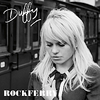 I like this monochrome image on the album cover as it emphasises how the artist is a bright contrast against the dark background. I would like to experiment by doing something similar to this because I really like the vintage style and effect it creates. The old fashioned train in the background is a good representation of Duffy's old blues style of music. All of the photographs have artists on the front looking down which may symbolise the emotion and lyrics in the song.
Subscribe to:
Comments (Atom)